Saturday, 26 January 2013

Indoor Picnic: Get your cosy on!

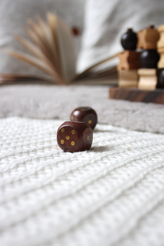
A little while back, Houzz asked me to come up with a fresh idea for a winter shoot to inspire readers to enjoy their homes during these chilly months. Because picnics are one of my all-time favourite pastimes, I decided I would do a rustic inspired indoor picnic setting. I thought I would share some of my favourite images of the shoot here that weren’t used for the article

The shoot was set in a gorgeous local Delft studio belonging to two interior designer friends of mine, Tessa and Nathalie of Nu Interieur|Ontwerp. I wanted the shoot to have a warm and rustic feel about it, so I used lots of blankets and pillows and poufs to create a comfy and cosy setting. The food was a simple array of cheeses, fruits and a home-made pecan pie I prepared especially the night before, arranged on wooden platters and paddle boards. The fun of picnics doesn’t end with the food, so I brought along some games, books and cards to inspire readers to linger a little longer. The response to this concept was lovely to see, with several readers sharing their personal childhood experiences of picnics they enjoyed indoors. 


I enjoyed compiling this piece so much, that I invited friends over to enjoy a cosy indoor picnic at my home with us, and it was so much fun! We listened to music playing softly in the background and chatted away while enjoying a simple spread similar to what has been photographed here. You should try it sometime. 

 Want to find out what products were used in this shoot? All the details, including the recipe for the mouth-watering pecan pie, can be read {here} in the full Houzz feature.  

To those of you who are also freezing their butts off like me over here in the Netherlands, keep warm and get your picnic on!

 Love, Holly

* All photography is by Holly Marder for Houzz

Friday, 18 January 2013

Innovative design talent wows at imm Cologne’s [D³] Contest

This week began on a very high note when I attended one of the biggest and most prominent furnishing, lighting and interior design trade shows in the world, imm Cologne. I was invited (along with a bunch of other bloggers) by Holly Becker of Decor8 to attend her keynote at the international bloggers meet-up ‘We Are Social’. Alongside Holly on the panel of social media heavyweights were Steffi Luxat of the blog Ohhh Mhhh, Will Taylor of Bright.Bazaar, Frederik Frede of Freunde von Freunden, Costas Voyatzis of the blog Yatzer, all sharing their personal experiences and success stories to demonstrate how to use social media to build success in the international blogging sphere. I was also delighted to meet the perpetually sunny Igor of the equally sunny Happy Interior Blog, who organised a most delicious welcome lunch for all of us bloggers before the panel. Thank you, Igor!

I went along to Imm with the hopes of killing the proverbial two birds with one stone. After the lunch, panel and some networking, I set out to soak up some of the sights of the fair. With little time on my hands and a lot of ground to cover I headed straight for an area which I was particularly excited about: the [D³] Contest, where fresh new designers showcase their brand new prototypes to the international design world. Camera in one hand and notebook in the other, I interviewed and snapped shots of these promising young talents for my Houzz column. You can read the full article {here}.

Of the talented designers I profiled for my story, there were a few that really stood out for me for their concept, aesthetic and marketability. What you should know is that of more than 600 products submitted to the contest, just 21 prototypes were selected to be presented by their designers at imm. Three of these innovative products won the prestigious Interior Innovation Award. One of them was the clever Lucien Gumy, who showcased his L´Étagère en Bois, a shelving unit that can be assembled without a single screw, bolt or a smidgen of glue. Clever right?


“I played with horizontal and vertical assembly methods until I achieved a method that requires no screws or glue, and can be dismantled," says Gumy. "I took this process and repeated it at all the intersections.” The size of the unit can be adjusted by mixing elements of different lengths.


For me, the most marketable product I saw in this section was ‘Pilu’ a floor and desk lamp design by Leonie Werle that is based on aesthetic simplicity and beauty. Werle's design stemmed from her own search for an adjustable desk lamp without visible wires and joints. "I wanted to create a lamp that was adjustable, but a practical and attractive lamp that will provide an indirect light source," she explained to me. I secretly wanted to pop the little yellow desk lamp in my handbag on the day. I love the clean lines and fuss-free look of Pilu, as well as the solid oak base, and hope that it finds it’s way into stores before too long.


I also really liked the concept behind the ‘Invader’ a stackable modular storage unit designed by Maria Bruun. The beauty of this product lies in its flexibility to grow with it’s owner’s individual needs, as well as it’s clean-lined aesthetic.

Bruun wanted to delve into what exactly constitutes the notion of ‘home’ for people when developing the Invader. “‘Home’ is made up of the things that people own: their pictures, books and souvenirs,” she says. “I discovered that through these collected items, people tell stories about their past, their present and their dreams for the future.” Upon this realisation, she designed this robot-esque structure that acts not only as a storage unit but a creative display unit at the same time. Cool!


I am big on chairs, and when I saw the prototype of the ‘Beams Chair’ by Taiwanese design duo Eric Chang and Johnny Hu, I really felt the design is marketable and smart. The inspiration of their simplistic design is owing to the H-beam structure of San Francisco’s iconic Golden Gate Bridge, and weighs a mere 3 kilograms despite the use of two types of wood, multiplex and plywood. I love the matching table in this collection too and do hope to see it for sale one day. 


The final prototype I found pretty damn interesting was ‘Dear Disaster’, by Jenny Ekdahl. It is a storage cabinet, encrusted with scale-like wood chips all over the surface that can move beneath the fingertips. The inspiration for this piece came from a fascination with how humans respond to terrifying situations brought about by nature. She wanted to create a piece of furniture in which we as humans could connect emotionally. “My interpretations of natural disasters are used as a metaphor to describe the importance of emotional and poetic experiences in design for today and for the future,” Ekdahl explains. The design represents two contrasting symbols of nature, earth and water. 

I could go on forever with other amazing prototypes I saw, but these were a few that I would have taken home with me. 

I am curious. Which is your favourite?

Holly

Friday, 11 January 2013

How Pinteresting: Charming Lisbon holiday apartments spell perfection

Happy New Year to all of you out there! So much has happened over the Christmas and New Year break that has kept me sufficiently busy (hence my absence from Love, Thomas). All will be revealed in due course but for now, I wanted to  kick start a new series I am putting together each month called ‘How Pinteresting’, where I feature particularly gorgeous eye-candy that I have discovered (promptly repinned and drooled over) on Pinterest.

In this first edition, I bring you Baixa House, the most charming holiday apartments I have ever seen, situated in downtown Lisbon, Portugal. I first discovered the gorgeous interiors you see below while browsing the Pinterest board of Sonia van der Zwaan-Barrigas of Gosto Design. Suddenly, I was carried away on a beautiful journey through not one but 12 absolutely gorgeous, newly refurbished apartments! It’s pure eye candy and I am beyond excited to share these images with you.

The 18th century structure, erected after Lisbon’s 1755 devastating earthquake, has been fully refurbished to provide style savvy travellers with a cosy home away from home. The delicately composed interiors feature a balanced combination of the old and the new, with subtle use of colour and a botanical theme being the common thread that ties the spaces together. Interestingly, each apartment is named after a Lisbon garden which has inspired its design. I am swooning over the designer’s amazing choices when it came to the furnishings and colour scheme. Just absolutely stunning. Here goes!


The ‘Belem’ apartment employs a fresh and light aesthetic of neutral with pops of green and a botanical feel about it. I just love the jolts of colour that bring life to the room’s subtle palette.


The ‘Fronteira’ apartment has the most glorious bedroom, combining natural elements, tones and textures with swoon-worthy botanical prints above the bed. Rugs in cobalt blue are an interesting addition that take the composition from ordinary to extraordinary.


In the ‘Alorna’ apartment, the building’s original tiling was used as the basis for the colour palette, which draws upon earthy tones of brown, deep red and navy blue. The botanical theme continues in this space, while eye-catching brass ornaments and light fixtures mix with an eclectic array of furniture.


Here, a retro table and chair placed beneath a window makes for a sunny spot for afternoon tea, whilst in the kicthen, there’s gorgeous kitchenware to be found for enjoying an easygoing breakfast.


Botanical touches pop up here and there in the ‘Jeronimos’ apartment once more, through fresh flowers, delicately floral wallpaper adorning one wall in the kitchen, and prints above the bed. 


The bright yellow floral wallpaper in the ‘Necessidades’ apartment’s kitchen is absolutely delightful and perfect for a sunny Portuguese getaway in Lisbon. Bright pops of colour are brought back to eather with natural wood tones in the bedroom crisp whites.


I adore the fresh palette of the ‘Universidade’ apartment which ties together shades of beige, duck egg blue and ochre, adhering once more to the botanical theme throughout the rest of the building. Lovely!


I love the soothing pale tones used throughout. This is a holiday home I could definitely do some relaxing in!


The top floor apartment ‘Principe Real’ features an eclectic ensemble of rustic furnishings against the signature white backdrop. Naturally, the building’s original exposed beams were utilised to add to the rustic look and feel and I adore the injections of bright turquoise and tangerine.


It’s all natural tones in the neighbouring top floor apartment ‘Ultramar’ with the odd burst of sunshine yellow, and of course, the signature florals popping up here and there through a gallery wall above the bed.

To me, this group of apartments encapsulates my idea of what good interior design is about. A clever mix of old and new pieces - some dear to the heart, some key investment pieces, some inexpensive contemporary items - soothing natural tones to encourage relaxation at home with sporadic bursts of colour every so often for energy and fun.

I hope you enjoyed discovering this Portuguese gem with me! If you want to enjoy more gorgeous eye-candy with me over on Pinterest, follow me {here}.

Holiday anyone?

Love, Holly