Friday, 11 May 2012

Colour crush ~ Coral and Mint


Coral and mint, watermelon and turquoise, raspberry and teal, peach and pistachio or just plain pink and green. Whatever you want to call it, the combination is beautifully fresh. Placed together or separately, I’m seeing these summery hues a lot at the moment in interior design, particularly mint and turquoise. Perhaps it’s the spring air getting to me here in Holland, but I just can’t get enough of fresh mint combined with cool coral. 

Holly Marder for Love, Thomas


There’s a very odd little tree in our back garden. I came very close to chopping its twig-like figure down last year, but I’m glad my better half stopped me in my tracks. The once bare skeleton of a tree is now covered head to toe in the most spectacular coral coloured blooms. It looks beautiful, even if the rest of our garden still echoes a chilly winter that is struggling to depart us for the year.

I just had to steal a twig or two of these blossoms and throw them into a vase, because they are a reminder that (though I'm seriously starting to doubt this fact) summer is on its way. I arranged a couple of stems into a pale mint coloured Jamie Oliver pitcher I plucked from the kitchen, and was struck by the combination of these two lovely colours. Fabulously fresh, a touch of these colours, alone or together, in any room are sure lift the spirits!


Flat dish: Anthropologie; Chair: Caitlin Wilson Design; Table and chairs: Philip Galanes, Peony and roses: A Creative Mint; Plate: Anthropologie; Bathtub: Casaviva Magazine; Bathroom: Brooke Gianetti for Velvet & Linen.

Having trawled the net to bring you some inspiration, I have found this combination is not too common. Surprising, because they are just so lovely together. Because they are both such strong colours in their own right, however, they can overpower a room very quickly. The best way to incorporate them into your home is to add accents of each colour in the form of throw cushions, fresh flowers, upholstery and crockery.

Eames rocker: Julien Fernandez, Chevron blanket: Ivie Baby on Etsy; Nursery (top): House of Turquoise; Nursery (top right): via The Style Files; Nursery (right): via Nest Pretty Things.

I adore the use of these colours in a baby nursery. Soft and dreamy, they are not too feminine, not too masculine. Again, a few accessories in a neutral setting will strike the balance perfectly.

Have a beautiful weekend, lovely readers. Wishing all you fabulous mummies out there a very happy Mother's Day! It's my first :)

Love, Holly

Monday, 23 April 2012

The art of mismatching

Patience is not my most redeeming quality. Anyone who knows me will confirm this.

Recently, my lack of patience led me to sell our entire dining room suite on a whim to a poor, unsuspecting student, leaving us with a bare room that echoes with emptiness.

I just couldn’t stand the sight of our cheap IKEA table and chairs - which we had bought for practicality more than anything else - any longer. It was getting in the way of things. I figure it’s better to have an empty space and imagine the beautiful things that could be there, than to live with the things that are there that irritate me on a daily basis. It was time to move on.

It’s now that same empty space that has been irritating me, as we lead our dinner guests to the living room to eat cross-legged around the coffee table.

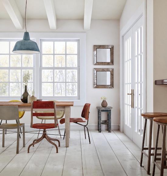
I have been playing around with the idea of mixing several design styles. Antique, retro and vintage pieces can look striking against modern, clean lines, and all are styles that I love. I deduce that the perfect way to go is a mismatched affair. But how to create a perfect, balanced look out of several design styles and pieces in one setting?

Rene Mesman

Mismatching can be a tricky business, but can be very rewarding when done right. Throwing a few random pieces together and hoping it will work will not necessarily get the desired effect, which is, of course, a well balanced and effortlessly eclectic dining space.

Though there are no set rules to mismatching different items of furniture, the general rule of thumb is to find a common thread that ties each item together. Whether this is the shape, material, colour scheme or style, one common theme will help to bind the look together.

Choose your colour scheme Settling on one colour palette will help to tie each piece together and keep the look from looking downright cluttered.

Susanna Vento


       In this relaxed, eclectic space, black and white is the dominant palette, with small splashes of colour here and there. Though not one item of furniture in this dining suite matches another, the choice of black and white has united them as a whole. Visual interest is created through the addition of one extra colour - in this case, blue. The reason this look works is because it has not been too carefully thought out, but rather pieced together bit by bit to give it an effortlessly eclectic aesthetic.


Design for Man Kind

This Scandinavian inspired space is limited to a simple colour scheme of white, black and wood. Though each chair is different in style and material, the look is harmonious.


via All the Pretties


 Couple like materials Whether you start with wood, metal, plastic, or fabric chairs, keep your material choices down to one or two. Start with one or two chairs that you absolutely love, and build on the look from there. If they are wood and fiberglass, throw in another couple of wooden chairs, one or two plastic chairs and an element of surprise to complete the look, remembering to adhere to your chosen colour scheme.

abryanphoto.com


This romantic setting is owing to a huge collection of wooden chairs, all different though with similar features. You couldn’t have created this vintage look with identical chairs.

Work with similar design styles Whether you are going for a vintage, retro modern or traditional theme, try to work within the same design framework.

Jason Lee
via All the Pretties


A quintessentially vintage look ties this space together, along with one or two dominant colour choices - tangerine and pale blue - which anchor the design style.

Lauren Gyll via Houzz.com

This room has a distinctly classical feel about it. I love how the designer has thrown in one contemporary chair for contrast and intrigue.


Play with patterns Have you got a few fabric chairs? Pairing similar fabric styles, colours and patterns will tie the look together.

The perfect combination If you can manage to group all of these ideas together in one space, you might just pull off a look that has more to it than meets the eye.

Anna Malin


The above look combines all of the ideas I have spoken about to create a cohesive, fun and personal space. The colour scheme is limited to black, white and pale blue, with an element of surprise thrown in for good measure in the shape of those fire engine red lamps. The materials are consistent with one another, and the design style is faithful to its retro/vintage theme. Though it looks as if this collection of chairs were thrown together, this look was well thought out.


Do you like the mismatched look or have you tried it in your own home? Do you have anything to add to my tips? I would love to read your comments in the section below.

I only hope that my own mismatching efforts work as well as these examples!

See you back here next week.

Love, Holly

Sunday, 15 April 2012

Hand Picked DIY Inspiration

Right on schedule, just after Easter, the cooler weather has descended on Brisbane. The days are noticeably shorter, the nights significantly cooler and my desire to stay at home and get knee deep in some DIY is at an all time high.

Type in the words 'home DIY' into any search engine and you will bombarded with more projects than any one person has the Sunday's it would take to complete them. Never fear though faithful readers, I have done the leg work for you and found my favourite home design DIY projects complete with links to how to make them yourself - (I know, I'm amazing, you can thank me later)

My usual criteria is simplicity, neutral tones and charming. In my books, all the below links hit the mark, so for as long as the rain persists I will slowly tick them off my weekend to do list. Have a browse and see if any get your own creativity flowing.

Window Picture Frame
Source

Shutter Notice Board

Source

Bike Wheel Pin Board

Source
Wall Decal 
Source
Jar Labels
Source
Mason Jar Chandelier 
Source
Copper Coil Vases
Source
Doily Lamp Shade
Source
Rake Necklace Rack
Source


Feel free to let us know how your own DIY projects turn out.

Love, 
L

Saturday, 7 April 2012

Our Love, Thomas Reunion

There's a reason we have been rather absent from our Love, Thomas posting of late. It brings us so much joy to report that we have been enjoying each others company, in person, on the same side of the world! Our much needed Love, Thomas reunion took place over three sunny weeks in Australia.


Now that we are back on our respective sides of the globe again, and are more inspired than ever, we promise to keep the posts coming.

Thank you for reading Love, Thomas. We love having you here!

Holly and Lauren

Monday, 20 February 2012

Indoor ~ Outdoor Fusion

The summer months in Australia are ideal for throwing open the doors, turning the fans on full blast and finding somewhere soft, preferably with a good breeze, to read a book and sip a cold drink. So if you live in this part of the world, it's essential you are set up for indoor/outdoor living. 

Sadly, Summer is drawing to an end over here, but living in Queensland means we will likely get quite a few more weeks of warm weather to make use of some of the wild and wonderful indoor/outdoor inspiration I have found this week.

Enjoy x

A day bed is a must for those afternoons so hot, moving is simply not an option.

Source
Source 


Dining outdoors is the perfect way to make the most of warm weather can add extra flavour to the experience*


* the flavour of the food is still up to you.

Source
Source


If being completely outdoors isn't an option, consider setting your dining area in a covered balcony or conservatory.


Source
Source
Source
Source


Windows, windows and more windows! Open them wide and invite the outside in. 


Source
Source
Source
Source
Source


For special occasions, utilising your outdoor space for a romantic or family evening will surely be a crowd pleaser.

Source


Feeling very adventurous? Why not take your whole bed outside?
Note: strong rope, a lot of time and a few screws loose required.

Source
Source


Whilst not always practical, you can't deny the beauty of indoor flora.


Source
Source


No one will think any less of you however, if you take the easier option of just inviting the herb garden in and leaving the rest to nature.


Source

Have fun lovely readers.

Love, L


Saturday, 11 February 2012

Expose it: The beauty of brick

A recent home tour I did for the interior design platform Houzz has inspired this week’s blog post. The first thing I saw when I entered the house was one partially exposed brick wall, and it knocked my socks off. Paired with modern, clean lines, an exposed brick wall can make a dramatic statement and lend an industrial look to any space.

Holly Marder

This year, we are going to start looking at houses to potentially buy and renovate. I have a few things on my wish list in terms of the style of the house: it has to be an old place with great bones and huge potential, high ceilings, original features, be completely decrepit on the inside, and have at least one wall that is already or can be exposed. Am I being to precise? Well, precise or not, with this in mind, here is some inspiration gathered from far and wide to give you an idea of my kind of heaven :)

Design Sponge

When I think of exposed brick, images of loft apartments spring to mind, with industrial detailing such as exposed pipes, heavy duty nuts and bolts and cast iron staircases. The top and below few images fit that image.

Let me be inspired

Let me be inspired


Apartment Therapy via A Nomadic Abode


I love the inclusion of an exposed brick wall in the entry way, as shown below, and a gallery of photographs, prints or posters completes the look.

Design Sponge

The exposed brick wall below compliments the Scandinavian-retro vibe that the various items of furniture bring in. The wall however has to share the limelight with that amazing oversized door, but I love how both original features work in this space.

House & Home

Visualid
Mid-century furnishings look great against exposed brick walls and huge sash windows.

Built in shelving helps to break up this exposed brick wall, while it still offers texture to the space. I just love a rustic wooden floor beneath an exposed brick wall!
 
Hallie Burton

Exposed brick in the kitchen lends a typically industrial look.

Juno Harpoon
A sheer window covering and loads of books soften up this beautiful exposed and very weathered brick wall. What a great spot to soak up a bit of literature!

There are some places in the home that exposed brick doesn’t work too well, such as a toilet or bathroom as it can appear quite cold.

Which room of the house do you think an exposed brick wall looks best?

Holly